Silver Linings Counseling LLC Logo
Client: Erwin Gilliam, LPC
Categories:
- Logo Design
- UI/UX Design
- Brand Development
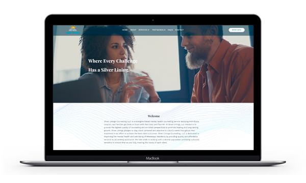
Site URL: https://silverliningscounselingllc.com/
Our Logo

Favicon
Overiew
In 2025, we collaborated with Erwin to create a custom logo that captures the meaning and mission behind Silver Linings Counseling. The design centers around the idea of hope, renewal, and growth — visualizing the “silver lining” that can be found even in life’s most difficult moments. Through soft colors, balanced lines, and a modern yet calming aesthetic, the logo communicates the compassionate and restorative nature of Erwin’s counseling approach while presenting a professional image that builds trust and comfort for clients.
Our artists worked closely with Erwin to bring his vision for Silver Linings Counseling to life. Through a series of collaborative discussions, our artist listened carefully to Erwin’s ideas about what the name “Silver Linings” represents — hope, clarity, and finding light through adversity. Together, they explored color palettes, imagery, and symbolism that would best convey these values. The result was a custom logo that feels both personal and professional, blending warmth and stability with a sense of renewal. This creative partnership laid the foundation for a cohesive brand identity that seamlessly carried over into the website design and overall presentation of the practice.
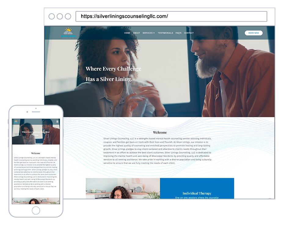
The newly designed emblem was employed in the promotional materials and acted as the fundamental basis for the color palette of the restructured website.
Design Tools:
- Adobe PhotoShop
- Adobe Illustrator
- AI Tools


